You did it. You finally got a website. It looks professional, the colors match your brand, and you're proud to hand out your business card. But here's the problem: months later, the phone still isn't ringing. Visitors come, they look around, and they leave—no call, no email, no sale.
If this sounds familiar, you're not alone. Most small business websites suffer from the same silent killer: they look good but don't work. The good news? The fix isn't a complete redesign. It's usually a few strategic changes that turn lookers into bookers.
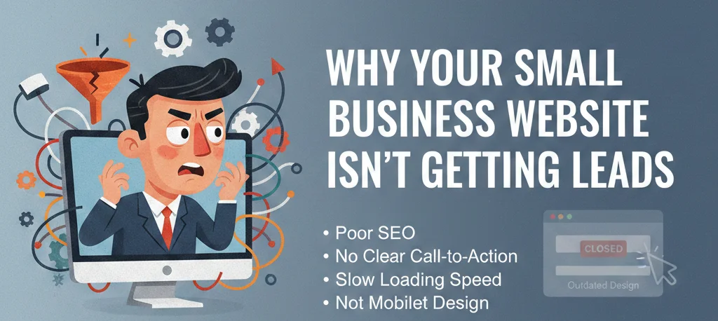
The Hard Truth About Your Website
Here's what your visitors are thinking when they land on your site: "Can this business solve my problem?" They don't care about your award from 2019. They don't care that you've been in business for 20 years. They care about one thing: can you help them right now?
Most small business websites bury the answer. They lead with "About Us" instead of "How We Help You." They use industry jargon that confuses potential customers. They make visitors hunt for contact information. And in 2026, if you make someone work to find your phone number, they're already calling your competitor.
Reason #1: Your Visitors Don't Know What to Do Next
Take a hard look at your homepage right now. Within the first 5 seconds, can a visitor answer these questions?
- What do you actually do?
- Can you help with my specific problem?
- What's the next step to hire you?
If the answers aren't immediately obvious, you're losing leads. Every page on your site should have one job: guide visitors toward taking action. That action might be calling, filling out a form, or booking a consultation. But it needs to be crystal clear.
The fix: Add a clear, prominent call-to-action above the fold. Not buried in the footer. Not hidden behind a menu. Right there, in the first screen visitors see. "Call Now for a Free Quote" or "Book Your Consultation Today." Make it impossible to miss.
Reason #2: You're Talking About Yourself Too Much
"We are a family-owned business with 25 years of experience." "We pride ourselves on quality workmanship." "Our team is dedicated to customer satisfaction."
Sound familiar? This is what we call "we-we" marketing. It's all about you, and your customers don't care. They care about themselves. They want to know: "What's in it for me?"
The fix: Flip the script. Talk about your customers' problems and how you solve them. Instead of "We offer professional plumbing services," try "Stop stressing about that leaky faucet. We'll fix it today so you can sleep peacefully." See the difference? One is about you. One is about them.
Reason #3: Your Website Is Too Slow
Here's a stat that should scare you: 53% of visitors leave if a site takes longer than 3 seconds to load. That's more than half your potential customers gone before they even see what you offer. And once they leave, most never come back.
Google also punishes slow sites in search rankings. So even if people are searching for you, a slow site pushes you down the results page where nobody looks.
The fix: Run your site through Google's PageSpeed Insights. If it's scoring below 70 on mobile, you have work to do. Common fixes include compressing images, minimizing code, and upgrading your hosting. A few seconds of speed can mean thousands in revenue.
Reason #4: Your Forms Are Asking Too Much
You want qualified leads, so you ask for name, email, phone, company size, budget, and a detailed message. The result? Nobody fills it out.
Every field you add reduces your conversion rate. Studies show that reducing form fields from 11 to 4 can increase conversions by 120%. People are busy and impatient. They want to contact you, not fill out an application.
The fix: Strip your form down to the absolute essentials. Name, email, and a brief message. That's it. Get them in the door, then qualify them on the phone. A shorter form with more leads is always better than a long form with none.
Reason #5: No Social Proof Where It Counts
You claim to be great. Every business claims to be great. What makes you different? Testimonials from real customers—ideally placed right next to your calls-to-action.
When someone's about to pick up the phone, they hesitate. "Is this company legit? Will they do a good job?" A testimonial at that exact moment answers their doubt and pushes them to call.
The fix: Don't bury your testimonials on a separate page. Sprinkle them throughout your site, especially near contact forms and call buttons. Use real names, photos, and specific results. "They fixed my roof in one day" is way more powerful than "Great service!"
Reason #6: No Clear Value Proposition
Why should someone choose you over the 10 other plumbers in town? If your website doesn't answer this clearly and quickly, visitors will keep searching.
Your value proposition isn't "we're the best" or "we care about quality." That's what everyone says. Your real value proposition is specific: "24/7 emergency service with no overtime charges" or "Free estimates with photos included" or "Same-day service guaranteed."
The fix: Identify what truly makes you different—not just better, but different—and put it front and center on your homepage. This is your competitive advantage. Don't hide it.
Reason #7: No Mobile Experience (Or a Bad One)
Here's how most people find local businesses in 2026: they're on their phone, often in a hurry, often with an emergency. If your site isn't optimized for mobile, you're invisible to these ready-to-buy customers.
Mobile optimization isn't just about fitting on a small screen. It's about thumb-friendly buttons, readable text without zooming, and click-to-call functionality. If someone has to pinch and zoom to read your content or find your number, they're gone.
The fix: Test your site on an actual phone. Can you read everything without zooming? Can you tap the call button easily? Does the menu work? If anything feels clunky, it needs to be fixed. Google also prioritizes mobile-friendly sites in search results.
The 5-Minute Lead Generation Audit
Grab your phone right now and visit your own website. Time yourself. See how many seconds it takes to:
- Find your phone number
- Find a way to contact you (form, email, chat)
- Understand exactly what you do
- See proof that you're trustworthy (testimonials, reviews, credentials)
If any of these take more than 3 seconds, you're losing leads. If you can't find them at all, you're losing serious money.
A Real-World Example
A landscaping client came to us with a beautiful website. Stunning photos, great copy, professional design. But they were getting maybe one contact form submission per week. The problem? Their phone number was buried in the footer, and their contact form had 9 fields.
We added a sticky header with click-to-call that follows you down the page. We reduced their form to 3 fields. We added testimonials right above the form. Within a month, they were getting 5-6 leads per week—a 500% increase. No redesign. Just strategic changes.
What to Fix First
You can't fix everything at once. Start with the highest-impact changes:
- Make your phone number visible everywhere. Top right corner, header, sticky bar—multiple places.
- Add a clear call-to-action above the fold. "Call Now" or "Get Free Quote." Make it a button.
- Simplify your contact form. 3 fields max. Name, email, message.
- Add testimonials near your calls-to-action. Real names, real results.
- Test your site on mobile. Fix anything that's hard to tap or read.
The Bottom Line
Your website isn't a brochure. It's your hardest-working salesperson, working 24/7 to bring in leads. If it's not generating calls, it's not doing its job. And in most cases, the fix isn't a complete overhaul—it's fixing the friction points that stop visitors from becoming customers.
Start with the seven reasons above. Pick the one that resonates most with your site's struggles. Fix it this week. Then move to the next. Small changes add up to serious results.
Ready to turn your website into a lead-generating machine? Let's talk about your specific situation.